What is a mobile first approach?
When building a business website, you should keep in mind that visitors are viewing from 1 of 3 devices: Desktop / Laptop, Tablet, or a Smartphone. Taking a “mobile first” approach is significantly beneficial for two major reasons.
1.) More users are switching their primary internet browsing device from PC / Laptop to Smartphones. A recent study released data collected between Q1 of 2015 and Q4 of 2023. It shows that in the last quarter of 2023, mobile devices (smartphones) garnered nearly 59% of global website traffic. This number has been increasing on average at a rate of .778% since 2017. (data: statista.com)
2.) It forces you to focus on what matters the most for the sake of user’s experience from their smartphones. Then you can church-up the desktop version because as you can imagine, you’re working with much more real estate.
Let’s dive into the five important factors to consider when taking a mobile first approach.
Jump to…
- Condensing your Offer
- CTA Size and Location
- Unambiguous and Readable Typefaces
- Media Optimization
- Check Responsiveness
Condensing your Offer
We’re just going to nip this one in the butt. Priority #1 when considering a mobile first approach should be ‘condensing your offer’. Determine the main goal of the page you’re working on or the overall goal of your website’s sales funnel.
Tons of visual distractions and clutter creates a heavy experience for a user browsing your website from a device with a limited viewport. This is why it’s so important to simplify your goal and strategy. It’s not uncommon for a website’s mobile version to hide sections and elements you would normally see on their desktop version.
Condensing your offer also means to get to the point. You would think that giving your visitors all of the information they need would be the most effective method, but in reality too much copy / text / information can cause a reader to become unfocused and worse – abandon their efforts all together. Keep your website’s mobile version simple, laser focused, and to the point.
CTA Size and Location
Calls-to-action (CTA), typically buttons, are incorporated on every website. They link through to other sections, pages, or forms on a website. Although, an effective button can easily become an ineffective button on a smartphone if it’s in the wrong location, or if its the wrong size.
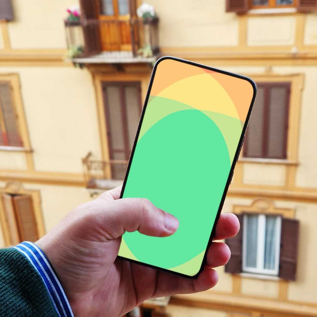
The rule of thumb when holding your smartphone; it’s far more useable and enjoyable when anything can be easily reached by using one hand. Try this – pick up your phone right now and access your lock screen. Once you’re there, take notice to where the shortcuts are for your flashlight, camera, emergency call, etc. (It depends on your phone and how you’ve tailored them) Where are your shortcuts – the bottom corners, correct? Do you think that is by accident or do you think they took a mobile first approach and intentionally placed them there for easy access?


If these shortcuts were in the top corners of your lock screen, you would be obliged to use multiple hands. I know…I see your eyes rolling like “first world problems”, but really it would be considered terrible UX. Imagine if you had to use two hands to get around Facebook or Instagram. I can guarantee you that those apps would not be relevant today.
Unambiguous and Readable Typefaces
The third important point to keep in mind when considering a mobile first approach is to use unambiguous and readable typefaces. You have to remember when developing your website, it’s very important to choose fonts that are clear and legible on smaller screen sizes. Written content is still king that last time I checked, so if your visitors are struggling to read the information on your business website because you thought using a display font would grab their attention or give some pazazz to your website’s appearance, on the contrary, it has the complete opposite effect.
Tips:
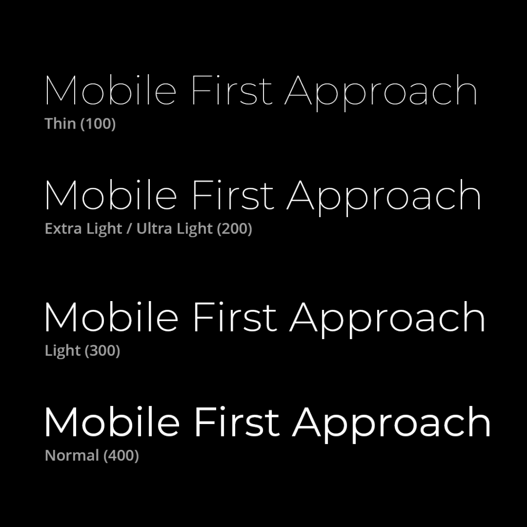
- Do not use font weights below the “Normal” weight of 400. This means – Light, Extra Light (Ultra Light), and Thin weights should be avoided at all costs. Advise the image below and you’ll notice that it becomes increasing difficult to read the words.
- Do not use absolute black (#000000) on top of an absolute white (#ffffff) background or vice versa for a few reasons: contrast sensitivity, harshness, aesthetic consideration, and accessibility.
Media Optimization
Your images and videos significantly enhance user experience on your business website, but if not optimized correctly, they can bottle neck the loading time of your website. This is a big factor in Google ranking. Optimize your media for smartphones to guarantee a quick and smooth user experience.
Tips:
- According to Statcounter, as of 2024, the most popular desktop resolution is 1920×1080, garnering almost 25% of the market. So when creating those backgrounds for hero sections, create a project with those dimensions.
- Use a service like Photoshop CC or Canva to optimize your image’s dimensional size and quality output. These two factors have a big effect on an images files size.
Reminder: This image you create will be loaded on both Desktop and Mobile versions of your website. - If you’re really savvy, you could go a step further and create a specific mobile version of that same image.
What dimensions should you use to create your mobile image?
Popular Mobile Portrait Image Dimensions:
1. 414 x 896 – 20.52%
2. 375 x 667 – 13.18%
3. 375 x 812 – 12.65%
4. 414 x 736 – 6.63%
5. 360 x 640 – 5.41%
I suggest going with something a little bigger overall, just to cover your bases. Let’s say 420 x 900 should do the trick, but your image’s height can be truncated to whatever you need. This way, when a user visits your website from their smartphone, instead of downloading the optimized desktop version, their device will only download the even smaller optimized mobile image.
Example: https://boulevardcarts.com – Their homepage’s hero section has an image for desktop and a separate version for smartphones.
Check Responsiveness
The final point I’d like to make is to always check your mobile version for responsiveness before you go live. This is how well your website’s mobile design, layout, sections, columns, elements, text, and everything in between respond within it’s mobile breaking points on multiple mobile devices, screen sizes, and operating systems.
Back in the day, developers would have to purchase actual devices to check the responsiveness of their website projects. Now internet browsers like Chrome or Brave offer a feature to view your website on multiple devices.
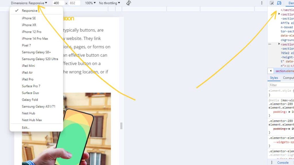
To access this feature, open Google Chrome or Brave, right-click anywhere on your website, choose the option to “Inspect”, then click the icon that looks like a laptop and smartphone, then you’ll see a dropdown menu reading “Dimensions:” appear. This will give you a long list of devices to emulate.
Following these five tips to a mobile first approach should help you focus on what’s most important and the effectiveness of your website for both smartphones and desktop devices alike. Visitors will enjoy their time spent on your website, stay longer, bounce less, and convert more into leads and sales!