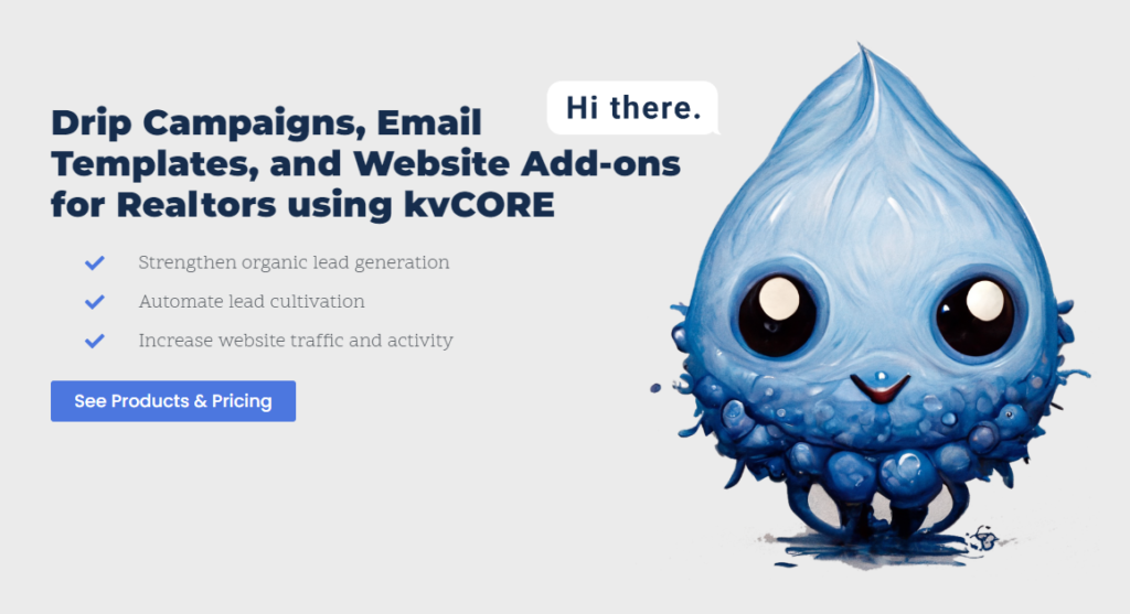
A website’s homepage functions as its virtual shop in the ever-changing digital world. It leaves an impression that can either enthrall or perplex a visitor. In today’s cutthroat online environment, creating clear and attention-grabbing headlines, updating generic menu labels, getting rid of pointless subheadings, and obliterate from your website the use of site sliders are all crucial tactics. Enhancing a seamless user experience involves adding timestamps to blog entries, strategically positioning social network buttons, ensuring authenticity in images, and optimizing email links. Come along as we explore 10 Things to obliterate from your website now and work through the complexities of optimizing homepages for optimum user engagement and conversion rates.
Jump to…
- Remove Homepage Headlines
- Remove Generic Menu Labels
- Remove Meaningless Subheadings
- Remove Hero Section Sliders
- Remove Stock Photos
- Remove Social Media Icons
- Remove Timestamps
- Remove Excessively Long Paragraphs
- Remove Testimonials
- Remove Email Links
Crafting Precise and Compelling Homepage Headlines
An ambiguous title on the homepage should be the first item we take down. While it’s a simple repair, insufficient descriptiveness can leave the visitor in the dark about what you do, posing a potential problem. It’s far preferable to have a straightforward and informative hero section on your site. Add the name of your company category to let the visitor know they’ve come to the right place!
Users of every website or webpage subconsciously ask themselves, “Am I in the right place?” as the first question. Visit Five Second Test (https://fivesecondtest.com) to take a 5-second test of your website. Don’t worry, it is free – just sign up. Employing this research method can assist you in determining the initial perception of your design/messaging. It often assesses user memory and determines how well a design communicates its intended message to users.
Get results in 4 steps:
1.) You’ll need to sign up for a usability testing tool like Lyssna, which is free.
2.) Create your test, uploading the image of your design. Include relevant follow up questions.
3.) You can recruit participants from your own audience, or recruit from Lyssna’s panel.
4.) Once your responses are in, you can view the results and use the insights to correct your design.
Many users will encounter the 5-second test and ask, “What does this company do?” Achieving a high score is probable if your copy (written text) is descriptive, the imagery relates to the copy, it is keyword-rich, search engine friendly, and everything works together to effectively convey the purpose of your website. If not, your unfavorable outcomes will assist you in determining what changes are necessary to greatly raise user engagement.
Revamping Generic Menu Labels for Seamless User Experience
In the early days of online browsing, the experience was strange and intriguing. Despite basic menus and sometimes ambiguous names, they were successful. Websites could include generic menu labels like “Products… Learn… Companies… Support…” for example, which may even sound like your website today. However, in today’s digital world, the typical internet user yearns for a more effective experience. Therefore, obliterate generic labels from your website as soon as possible. While they were acceptable in the past, current users, spending a significant amount of time online, demand clear and proactive navigation. As time is of the essence in maintaining user engagement, a lot of websites are adjusting to fulfill these expectations, realizing how important it is to stay up to date with the changing tastes of today’s savvy internet users.
Making your labels more specific may require you to reimagine your entire menu system and this is a UI/UX (User Interface / User Experience) project in and of itself. Think of your website in terms of an actual brick and mortar location. If a visitor was to walk into your store and they know what they want, it’s your job to get them to that thing as efficiently as possible. Too many turns may deter a visitor – clicks essentially work the same.
To understand how users utilize your navigation, check ‘Path Exploration’ in Google Analytics 4 (GA4) if your website is connected. This should give you a nice push in the right direction and shed some light on the flow of your website’s traffic. You can choose a ‘Page Path and Screen Class’, then select your Homepage. That’s where you will find the performance of your navigation and that’s how people are interacting with your website.
If you’re plan is to accomplish this yourself, I recommend taking your time, digesting the data in detail; and if you haven’t done this before, there will be a learning curve. In reality, this is where a professional will be beneficial. They’ll have the necessary experience reading this information, visualizing traffic flow based on that data, understand how to improve the flow, how to manipulate it, and drive results quickly.
Eliminating Meaningless Subheadings for Clarity
You can commonly find subheadings, also known as subtitles, within a website’s web page and/or blog articles. A subheading is a short string of text that appears beneath the main headline and provides further context of a paragraph or section.
With the evolution of the internet and increased user savviness, subheadings on web pages need to become more specific or be eliminated altogether. For instance, have you visited a website stating that the section you’re looking at is related to ‘Testimonials’? Or a section dedicated to ‘Solutions’? These examples and many others are unnecessary now. Obliterate these from your website, internet users are hip to these things now and those subtitles just take up vertical real estate.
If a section labeled “Testimonials” resembles the graphic below, discard the subheading. Testimonial sections have been around long enough to know what they are. As for sections like “Solutions”, these subheads scream sales pitch. Users don’t want to be sold, they want to buy. Also, people don’t talk like this. Ask yourself this – do you think internet users are typing in Google Search “‘your service’ + solutions”?
If you’ve done a good job refining your ‘solutions’ copy with targeted keywords, complimenting them with relatable imagery or icons, and optimizing those images with SEO, that will more than suffice. It will help visitors and search engines understand what you do. Otherwise, those subheadings are just visual noise.
Rethinking the Role of Homepage Sliders in 2024
Ahh yes, the infamous homepage slideshow. They look cool, but they are obsolete. There’s a lot of debate about this, but the data is pretty clear especially if there are tons of slides. Internet users are usually zippin’ around. You need to communicate quickly and effectively. If you’re going to have a slideshow within the hero section of your website – no more than 2 or 3 slides. Even that’s too much.
You really need to put yourself in the shoes of your targeted user. If slides are insisted upon, they should typically rotate every 4-5 seconds; otherwise, the communication may not be received, and the opportunity is missed.
My recommendation though, lose the slideshow! I used to run them years ago, and after monitoring my homepage’s Visitor Duration Data, then analyzing my HotJar Scroll Data; there was no possible way users were viewing all of the slides – and there were only 3 slides. It’s a waste and it’s also a page performance reducer due to loading time. That translates into a lower Google Ranking. No bueno!
I came across a thorough study found on Google called, “Do Rotating Sliders Help or Hurt Your Website?” The click through rates from users clicking CTA is abominable. I suggest reading the article yourself. It’s packed with tons of data, comparison charts, etc.
Ditching Stock Photos of People for Genuine Connections
Obliterate from your website those stock photos of people. Sure these images are polished, there are attractive people, lighting is great, but they aren’t credible and that’s not what the real world is like. Visitors can smell that from a galaxy away. As a small business it’s much better to use authentic photos / imagery. If this means you need to hire a photographer to visit your shop, it will make all the difference and display your true authenticity.
The Presence of Social Media Icons
As each year passes, having a social media presence is almost a standard as a small business. In my opinion, if you’re not taking advantage of social media platforms like Facebook, Instagram, LinkedIn, and X; you’re leaving money on the table. Although, communicating that you’re active on these platforms should be represented on your website in a modern way.
The first line item is related to those giant candy colored icons found in the header of your website. Sometimes I see them on websites and I cringe because it they go completely against the branding of a company’s colors and they function more as enormous exit signs than anything else. Pull those eyesores down. Traffic is hard to win and easy to lose.
Big icons with contrasting colors that draw the user’s attention away from the purpose of your website, only for them to go to your social media feed. The next thing you know, your visitor is checking their DM’s, notifications, and their personal feed. Any conversion potential has been lost completely.
Solution 1:
The best way to include social media icons is by putting them in the footer. Modern day professional websites place their feed links there and everyday internet surfers know that if they want to see if the company has a social media presence, the footer is a common place to find them.
Solution 2:
If you absolutely insist on including your social media icons in the header of your website, I highly recommend infusing your company’s brand colors. This will blend them into the overall appearance of your website and it will distract users less from wandering off into oblivion.
Solution 3:
Another clever and trending method of making your social media presence known is by integrating your favorite feed onto your homepage or what I like to do is incorporate it into my website’s footer. Smashballoon has developed a great asset that makes the integration process easier and it’s full of customizable appearance options. Allowing visitors to view your recent activity, engage in posts, and take action on follow buttons without having the visitor leave your website! I totally recommend it.
Timestamps on Blog Posts
Your viewers will be able to determine when your blog article was written if you timestamp it, even if it’s only the date. When they come across information, it aids them in determining its relevance. A post from recently or just published may look more appealing to them than one from years ago.
Generally speaking, it’s a good idea to include the publication date on your posts, especially if you’re updating them frequently. What about stuff that is timeless? It’s always current by definition, whether it’s due to the topic’s eternal relevance or ongoing updates. However, if your readers see the original publication date, they can become sidetracked.
I would like to be clear that removing the dates from blog posts isn’t an action intended for all websites across the board. Unless you have a news content strategy where you’re posting current events or you have a blog that requires a date to follow a story of your journey, then I suggest leaving the timestamp.
If your content marketing approach is more in line with producing general helpful articles that contain timeless information (also known as: evergreen content), you’re welcome to round file those timestamps because sometimes a timestamp can discourage a reader from trusting the information is current regardless if the information doesn’t change. An example could be an article about – Understanding your DSLR and Aperture. Or writing an article about evergreen content! The data doesn’t change.
Given this, is it OK to date your blog posts? One thing I advise you to consider before making a decision is if the date will be connected in any manner to the article.
Trimming Excessive Length from Paragraphs

Web designers know that visitors love whitespace, but writers…somehow they’ve missed that memo. Try not to write a paragraph longer than 3-4 lines. Big ol’ blocky paragraphs get skipped as a result of copy density. You have to consider that the common internet surfer is scan reading. Yes, you’re probably guilty of it – I know I am!
Let’s take a quick journey back to middle school when most of us really began learning the inner workings of sentence structure within a paragraph – I know…It’s been a while for many of us. The ideal length of a sentence is 100-200 words with a maximum of 5 sentences.
The Ideal Paragraph
- An introductory sentence
- 2-3 supporting sentences
- A concluding sentence
Other creative methods to break up a long paragraph is by using:
- Numbered lists
- Bullet point lists
- Bolded or italicized text
- Subheads with clear messaging
- Images
The idea is to deliberately slow down that scan reader, like you and me, and assist them in quickly finding what they’re searching for. Consequently, this enables them to jump into your content sooner. Moreover, given that most readers don’t read every single word, why not acknowledge this fact? By doing so, you can strive to make your content highly scannable.
Enhancing Testimonials for Maximum Impact
Testimonials are powerful social proof that should come packed with evidence. Some great ways that evidence is expressed within testimonials is:
- Statement backed up with data, statistics, and years in business.
- Awards & Trust Seals
- Genuine Avatar of Reviewer’s Face
- The Reviewers Name – For the sake of their privacy “Christopher S.” is a recommended format.
- Company Logo
- Enhance testimonials by supplementing related words with focus keywords if possible.
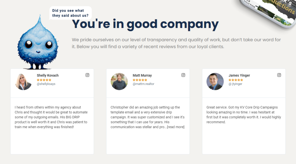
The best pages are filled with evidence and they don’t make a bunch of unsupporting claims. The worst website web pages are just piles of unsupporting marketing claims.
Don’t put your best social proof on a low ranking page like a ‘Testimonial’ page. If you have a testimonial page, don’t hide them there! Studies are showing that users are not navigating to those pages labeled ‘Testimonials’. My suggestion is to back up all of your reviews into a Word doc or Excel spreadsheet, and make sure each review checks all the boxes from the bullet list above.
Then place those testimonials throughout the website, or even better, near areas that are most relevant! A generalized example would be if you sold custom shoes and one of your clients purchased a pair of the shoes found in the product photo. Just below, embed a nice testimonial element. If you’re not quite sure how to do that, feel free to contact me.
Removing Email Links for Seamless Communication
The Purpose of Websites and Conversions
The purpose of all websites is to turn incoming traffic into conversions. Conversions can be a variety of things:
- An eBook download
- App install
- Content share on social media
- Newsletter subscription
- Sales
- Clicks on adverts
- Lead conversion
Facilitating Visitor Contact
We aim to simplify visitor contact with a brief message and contact details. Avoid hyperlinked email addresses on contact pages or footers because various email clients may not function properly. Clicking the link might lead nowhere, causing a lost opportunity.
| Email Link | Contact Form | |
| Trackable in analytics | N | Y |
| Can store a backup in database | N | Y |
| Can ask specific questions | N | Y |
| Can route message depending on answer | N | Y |
| Can route message to multiple people | N | Y |
| Works on any device, any browser, and no email software is needed | N | Y |
| Defends against spam | N | Y |
Key Takeaways
The biggest take-aways from this section is to obliterate from your website your email address because of
- Failed execution of mail client
- Unless you enjoy spam, bots that crawl the web LOVE when your email address is out in the open.
It’s clear as we explore the complex world of site optimization that the digital environment needs ongoing change in order to satisfy astute internet consumers. Everything from creating headlines that instantly make sense to placing social network symbols well and using real images with care all contribute to improving user experience. A more user-centric strategy is replacing the days of obsolete site sliders, long paragraphs, and generic labels. Websites may make a lasting impression in the cutthroat online market by adopting these insights and using them wisely. This will help them not only grab visitors’ attention but also turn them into happy customers.