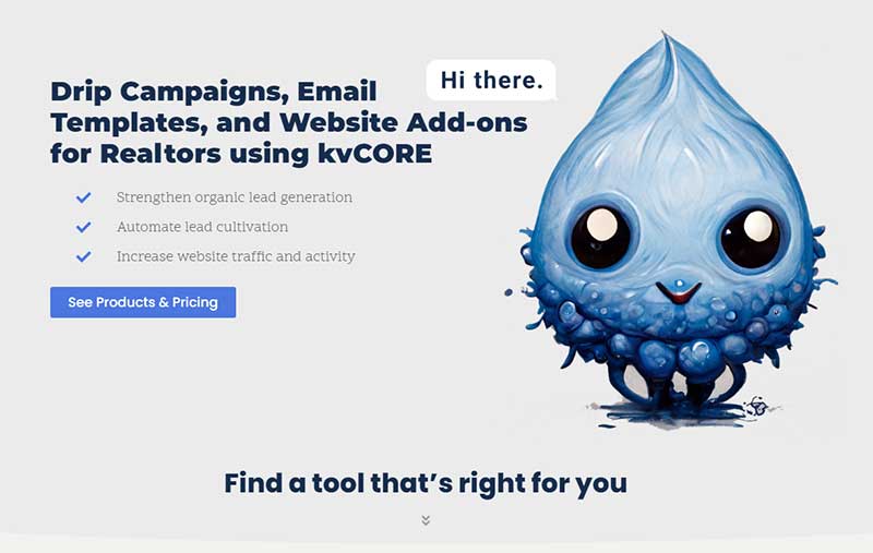
This was an interesting project. The product and/or service was extremely targeted to a CRM software called kvCORE. Inside Real Estate created this CRM software specifically for real estate agencies and agents. The beauty of this software is that it’s all encompassing: kvCORE provides agents with a single platform where they can manage customer relationships (CRM), generate leads through various channels, and access marketing tools to promote properties and grow their real estate business. It streamlines essential tasks and tools for real estate professionals.
Who they are…
kvCORE Drips (kvcoredrips.com) is a small Michigan-based business that decided it would be beneficial to the users and agencies utilizing the product to create semi-plug-n-play marketing campaign packages, newsletters / drip campaigns, and other various tools that enhance their experience by optimizing for user engagement and lead generation.

Project Overview
From our understanding, there was and still isn’t anyone else doing this, so it was important to strike while the iron was hot, in the sense of optimizing for SEO and messaging. We performed a variety of services ranging from Full eCommerce Website Design and Development, SEO Optimization, Keyword Research & Audit, Branding, Graphic Design, and much more.
There were three objectives: Maximize branding, maximize messaging, and streamline the sales funnel.
Branding:
kvCORE Drips had a good idea of what they wanted as far as color scheme and font, but they really wanted to create a mascot type personality to set them apart from all of the thousands of other business models available. No one had a mascot, so we created one! The Big Drip and his little friends can be found peppered throughout the website.
Messaging:
Messaging needed to be laser-focused and strong, but we didn’t want to over complicate it because I believe in providing the visitors precisely what they need. Nothing misleading, no over-wording of simple concepts – just direct communication.
Sales Funnel:
We wanted the sales funnel to be very straight-forward. A header menu that keeps the user on a path that always leads to a product or service in one way or another without feeling pushing. It’s more of a suggestive approach. In the end, it’s up to the visitor to say “yes” or “no” to the product. So we lean on the efforts of our messaging to convey value and credibility.
Planning the Project
To get the project underway, I always start with Figma. I love the cloudware because it gives me the freedom I need to be creative. As long as I stay within reasonable design practices, the transition between Figma and the actual website is usually smooth.
The image provided depicts a 30,000ft view of the website’s homepage with it’s vital elements: Targeted messaging and branding in the hero section, Products, Value proposition, Testimonials, Blog, and Contact form. Truly everything a user needs in order to make an effective decision and enjoy their experience on the website.
There was a lot of thought put into optimizing for smartphone responsiveness. Due to the limited view space a smart phone has in comparison to a desktop computer, it’s easy to over do it aesthetically, and just as easy to not do enough. Finding that balance isn’t always easy.
Check out the website for yourself: https://kvcoredrips.com


