My contributions at Stowe Cargo Systems will forever go down as one of the most demanding, challenging, explorative, and enriching experiences with a company. Like the old phrase goes, “Variety is the spice to life.” and my time with the company was most definitely on the picante-side of things. The position was originally intended to be strictly temporary, but least did I know, this was only the beginning.
OVERVIEW: What is the Stowe Cargo System? The product is a high quality weather tight toolbox and removable tonneau cover specifically designed for specific full-size Chevy, GMC, Dodge, and Ford trucks. This would allow the owner to utilize their truck furthermore professionally and/or leisurely.
In the beginning of the contract being a road warrior was the name of the game. I spent most of my days behind the wheel of a roomy fully loaded Chevy Silverado with all the bells and whistles. Originally, my responsibilities were to demo the product to dealers within Michigan and surrounding states, information gathering, build value, and most importantly – sell…sell…sell.
Jump to: Website, Graphics, Photography, Videography, Social Media, Analytics
The Website
The website – stowecargo.com has been around for a handful of years prior to the collaboration. At the time, the product presentation was lackluster, the website’s layout was not mobile friendly whatsoever, the sales pitch wasn’t there, and if someone wanted to know where they could get one (aside from directly purchasing it from the company) there was no way of finding that information other than calling the office or sending an email.
In other words, the website needed a major overhaul.
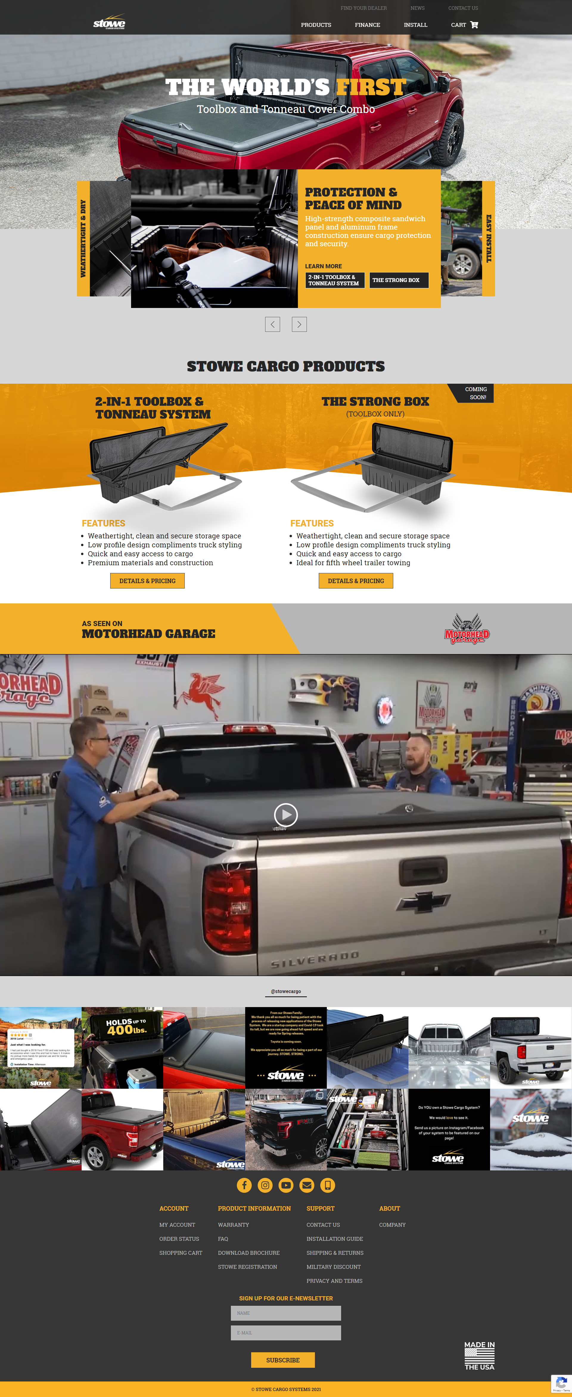
Screenshot #1 | Homepage
The homepage is the first impression. Users need to be wow’d and you need to carry that excitement through the funnel. It was important that we developed a consistent high quality and focused presentation. We needed to trim some fat, so we leaned up the menu system – too many options loses the visitor. We needed to keep visitors on the tracks.
Hero Section: Initial information presented needed to be powerful. Wording was chosen very carefully and the information / image used in the carousel needed to hook the visitor quickly and guide them closer to the sale – otherwise, they were bouncing.
Product Selection Section: During this period, Stowe Cargo was preparing to launch a secondary product called, The Strong Box. This was just the toolbox portion of the full Stowe Cargo System. Great for those who didn’t need the tonneau or didn’t want to purchase the complete system, but could upgrade in the future.
Credible Product Presentation: If the user didn’t select a product, they were presented an embedded video of the guys at Motorhead Garage installing and overviewing the product.
Last module was a Live! Instagram feed. This is a paid extension created by Smashballoon. Click here for their website. I absolutely love their extension because it gives the impression that the website is constantly evolving (as long as you’re company is actively posting on social media) and it gives the opportunity to drive user engagement on social media. The posts are opened in a lightbox and if the visitor is already logged into Instagram, they can interact with post directly from the website.
Screenshot #2 | Product Features
The product features page was the next step in the sales funnel. The idea was to help convey the value of the product by touching on all of it’s benefits and offering imagery to support. This page was comprised of automated slideshows that could be manually controlled as well.
Once the user cleared the benefits section, we presented the growing amount of 5-star product reviews which could be verified on social media or Google.
Lastly was the hotspot product benefit tool. When a user hovered over one of the hotspots, a product benefit would populate. The trick was making this widget work correctly on a mobile device.
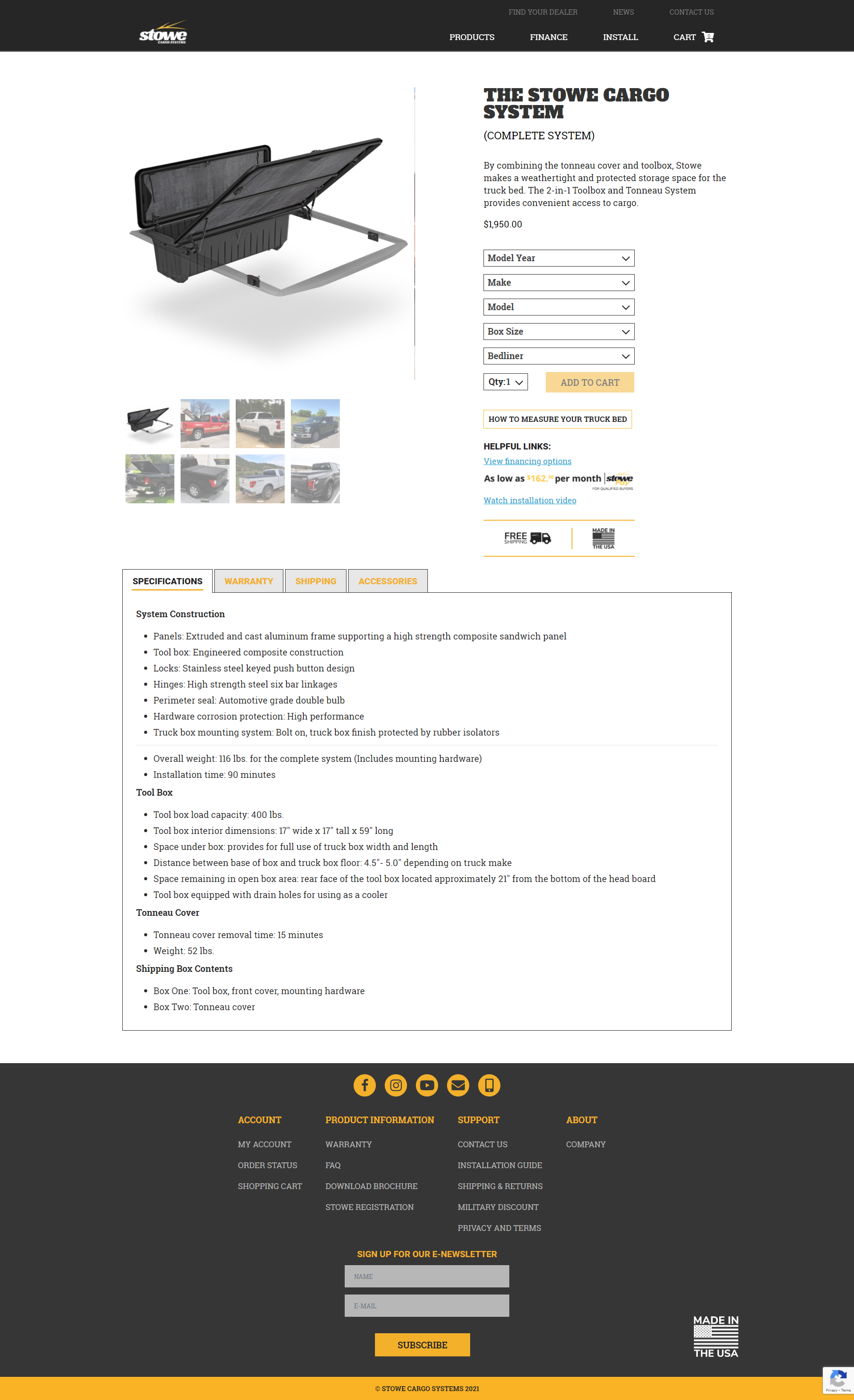

Screenshot #3 | Product Purchase
The functionality of this page is superior to any other page. It needed to be straight forward, easy to navigate, and user friendly. We gathered the best customer vehicle equipped with The Stowe Cargo System and set the default image to the rendered product image with improved texturing and shadows – giving this page a nice clean feel. Then we re-presented the product details, benefits, and specifications in tab format.
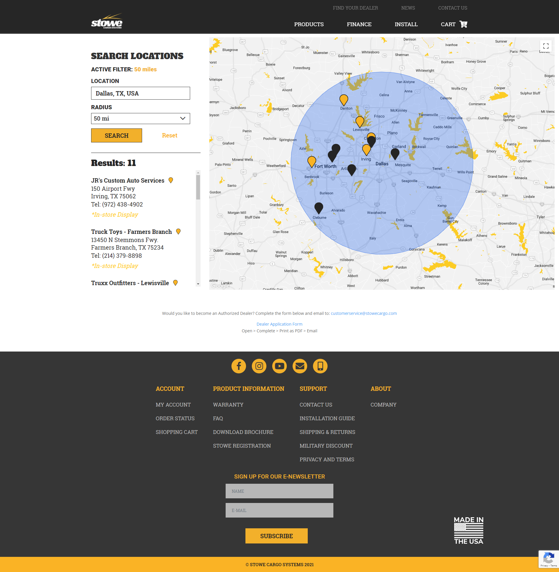
Screenshot #4 | Dealer Locator
This multipurpose tool was probably the best add-on we customized and utilized. With this tool we could inform the visitor where they could find an in-store demo, purchase, or have their Stowe Cargo System installed. This dealer locator also was great for relationship building with dealers across the country. At the time of our national tour, we we offering incentives to those whom wanted an in-store display. Those who accepted would be considered a “Premiere Dealer” and those dealers would be placed at the top of the dealer locator when users search their local area.
In exchange for floorspace, they received dealer locator priority.
Everything was color coded, the Google Maps API was color coded to match the brand colors, and the font family waterfalled throughout the various elements.
And it looked great on mobile too.
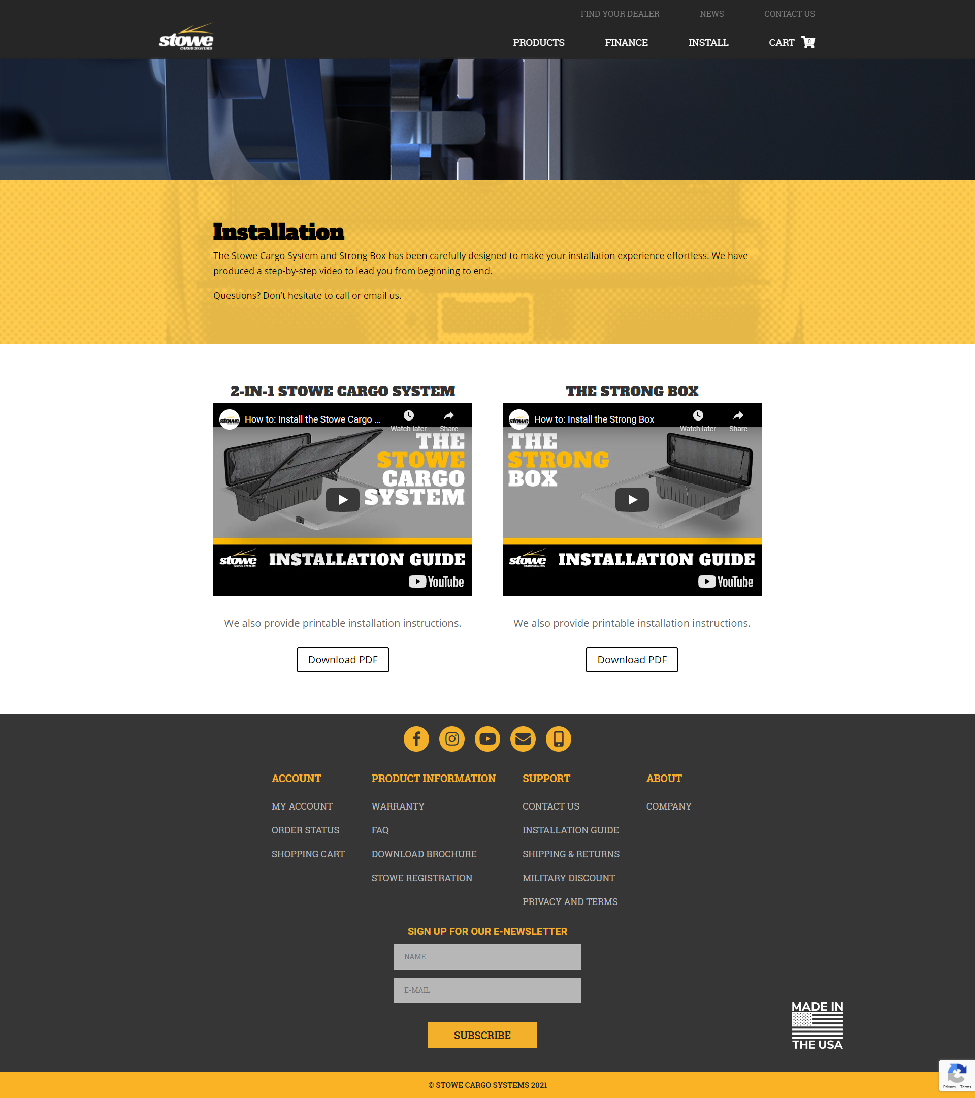
Screenshot #5 | Installation Support
The installation page’s refinement was pretty cut and dry. Create a default image for the embedded YouTube video so 1.) It looks great on the website 2.) It grabs attention on YouTube if someone finds it within their search results.
Since we were actively promoting The Strong Box, I went ahead and created a version of the installation video for it – creating a bit of symmetry and preemptively preparing for the official launch of the product. See the video here.
The Graphics
Through the contract with Stowe Cargo Systems, a wide variety of graphics were made – too many examples to upload, but a few great samples of my work and capabilities can be found below. I had created graphics for online promotions, newsletters, brochures, social media posts, the massive website overhaul, and more. I’ve been using these applications for the better portion of 15 years. My preferred software comes from the Adobe Creative Suite. Adobe Illustrator, Adobe Photoshop, and Adobe InDesign are my top three favorites.
Sample 1: Social Media Post
This was built with Instagram’s Multiple-Image Slider in mind. You can load up to 10 photos to a single post. When the batch of images are loaded, the viewer can swipe/slide through the images.
I thought, why not create an extra wide image and break it up into 3 separate images, giving the illusion to the viewer that they are revealing more of the image.
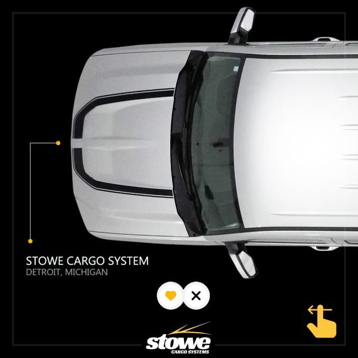
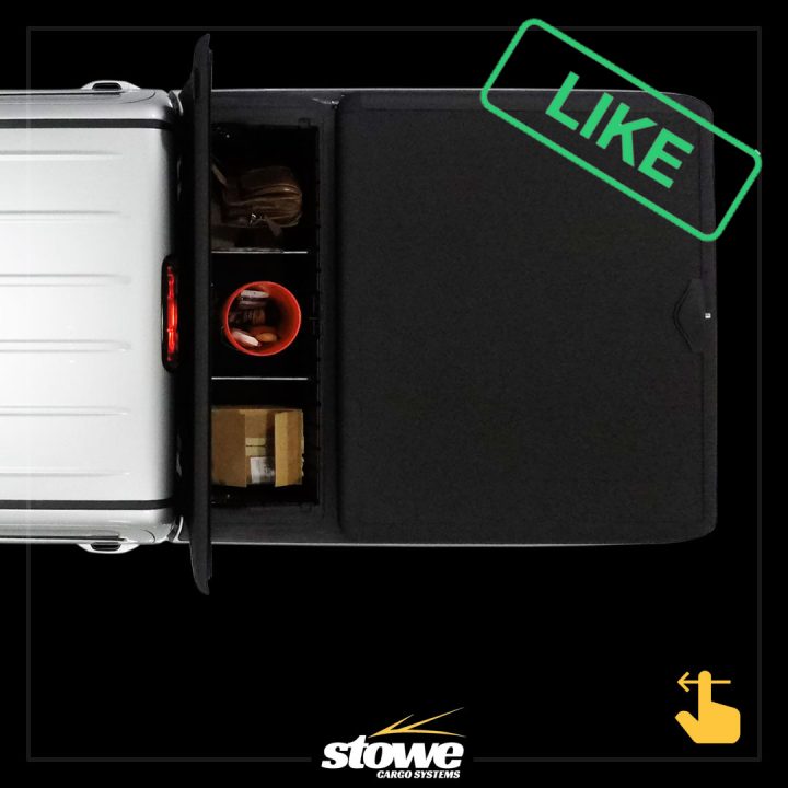

This graphic is comprised of an direct overhead photo of a Chevy Silverado equipped with the Stowe Cargo System. The toolbox was left open and loaded with a variety of belongings to show it’s storage capabilities. The photo was captured by using a GoPro Karma Drone.
Sample 2: Stand-Alone Product Rendering
When we were in the midst of overhauling the website, one of the changes we wanted was to give the 3D rendering of the Stowe Cargo System some depth and increase the accuracy of the product representation. The company responsible for rendering the product did not include the texture underneath the toolbox and tonneau cover panel. A few previous customers had brought it to our attention that they were a little disappointed that the underside of the panel wasn’t black, as represented on the website (the old one – at the time). This needed to change because they were right to be upset.
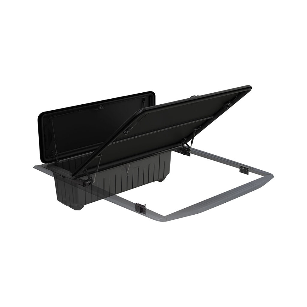
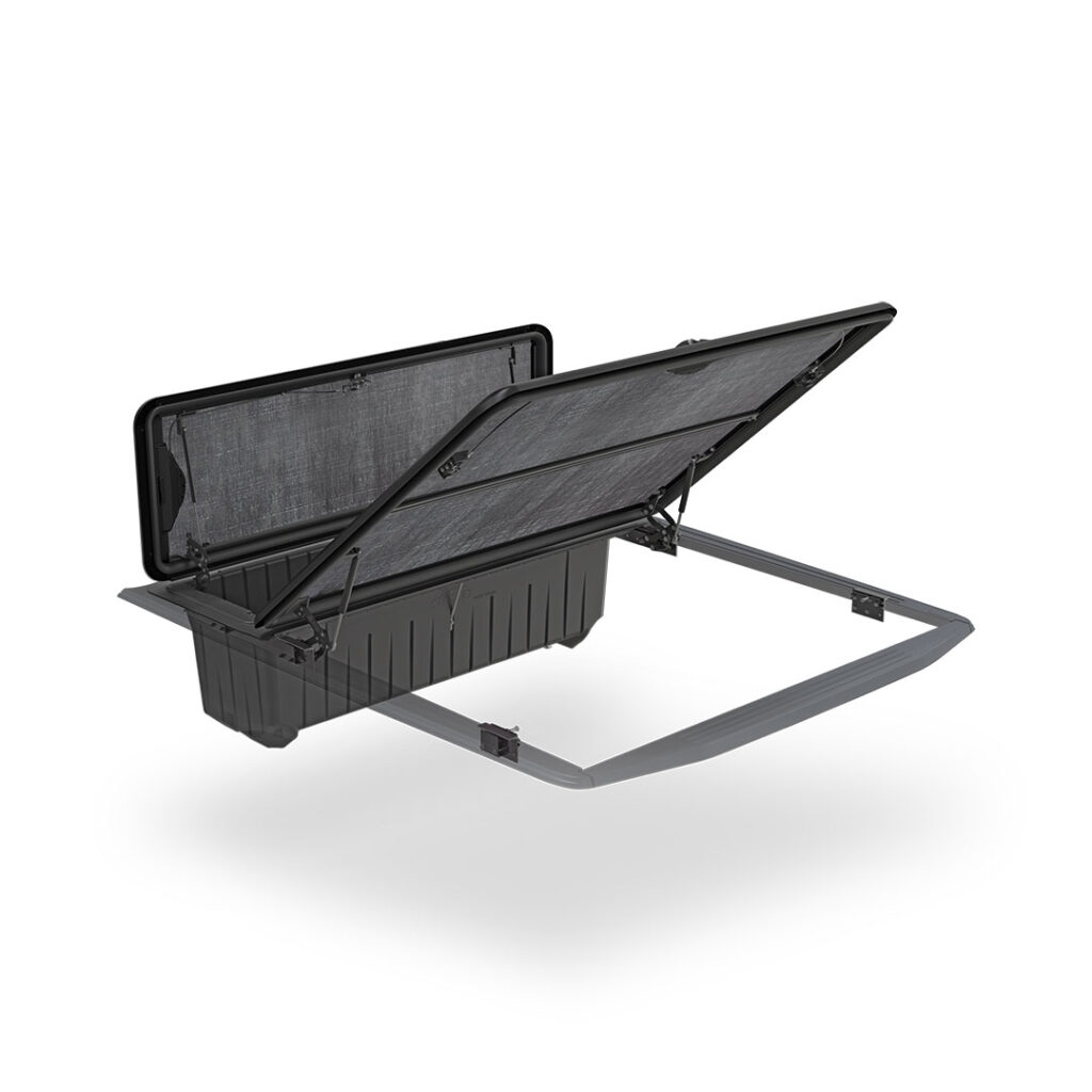
We got in touch with the company responsible for rendering the original image because we assumed it would be a much quicker thing. We sent a high quality image of the texture and requested a shadow to be added, but to our surprise, they wanted a considerable amount of money to perform these services.
I’m a yes-guy, so I took it upon myself to add the texture and shadow to the product. There was good amount of time invested (getting between the struts, cables, and locking mechanism), but the end result looked great!
Sample 3: The Tri-Fold Brochure
As we were about to launch the new website with a refreshed appearance and branding, I felt it was important to carry that same branding through to the literature we give to dealers and distributors.
Not to mention, we were planning a large scale tour a variety of states – visiting dealers all over the country. I thought it would be good to lead with our best foot forward when it came to promotional material branding.
The original brochures were good, but needed some polishing. I didn’t want to change layout to much because I thought it was done well, but information needed some refinement, as well as the graphics and copy.
Some of the images on the brochure were of a low resolution, which resulted in a pixelated appearance. (example: the background behind the truck on the cover page) They were replaced with high resolution image files for a crisp vibrant look.
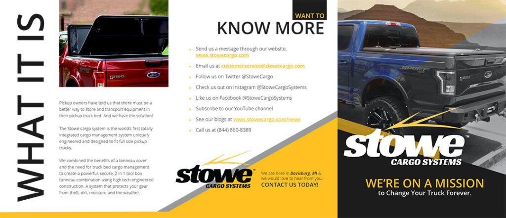
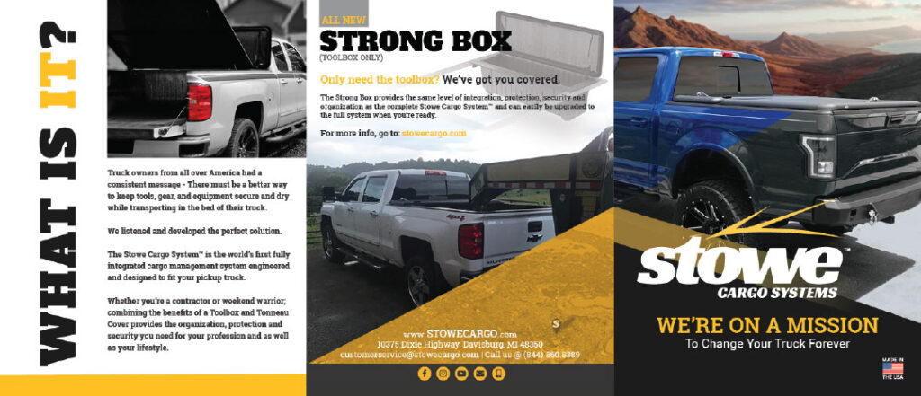
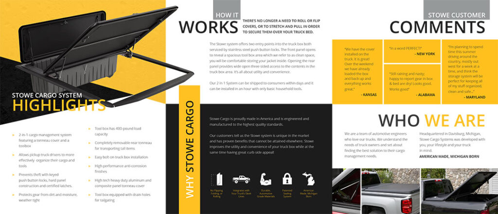
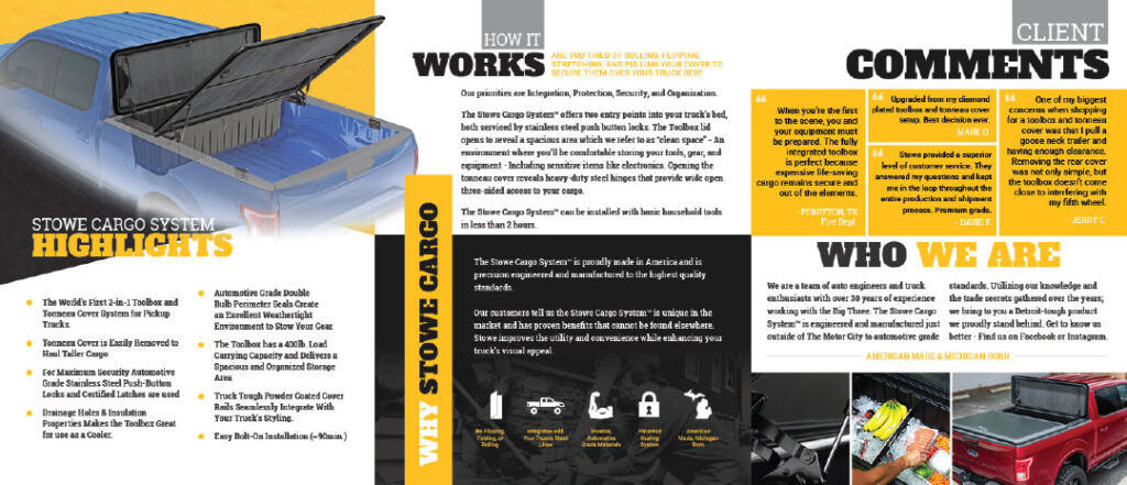
Now looking at the other pages below, you’ll notice the old Stowe Cargo System rendering. This was not only updated with the underside texturing, but I also superimposed it onto a truck.
The reason why I did this is because while I was on the road during my trial period (passing these out – the old design), a good amount of people couldn’t imagine how this product fits into the back of their truck. I specifically remember this happening a number of times and having to point at the other photos of the product. But! I thought, “Let’s leave no room for confusion and optimize every opportunity.”
When you drag the handle below, you’ll see that the new brochure design was updated with the new fonts, slight layout refinement, and enhanced imagery that generated excitement and engagement.
The Videos
Below are a variety of videos I filmed and edited for the company. Videos were shot on either DSLR or captured with a drone. Some sound was captured with an Zoom H4N Pro. To edit the segments, I use various Adobe Creative Cloud tools. Adobe Premiere CC and Adobe After Effects CC are my two go-to applications to get the job done.
The Photography
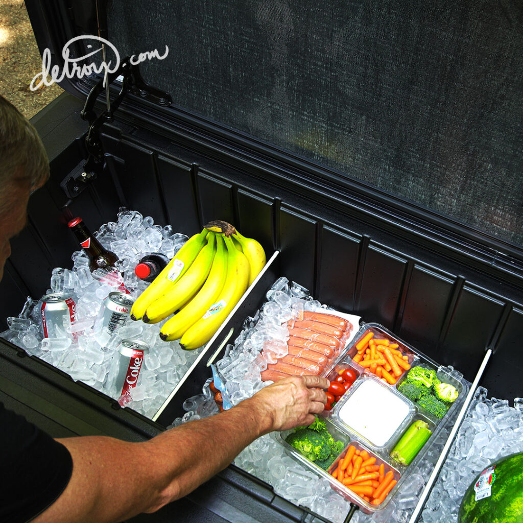
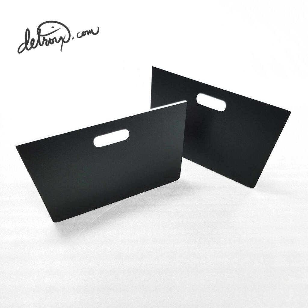
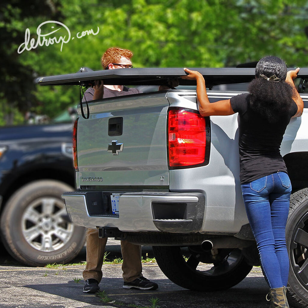
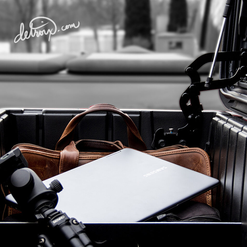
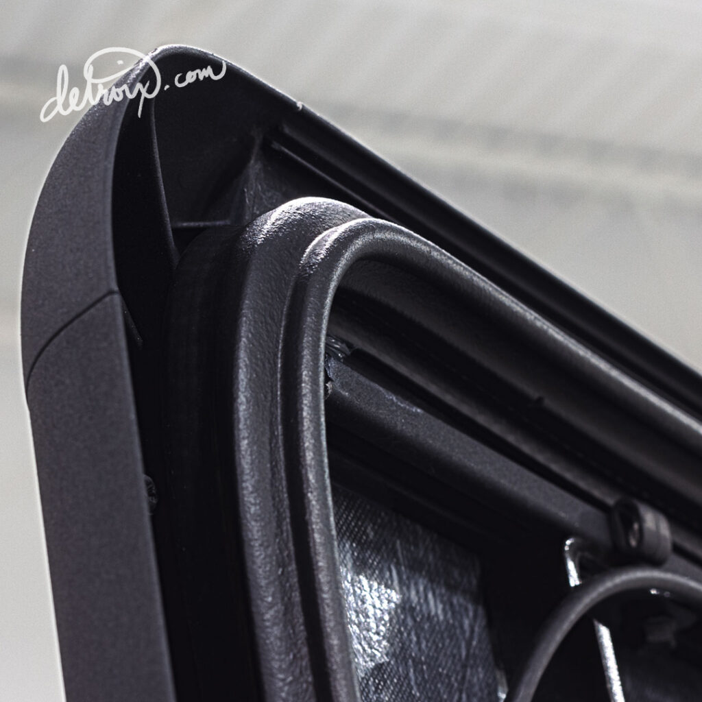
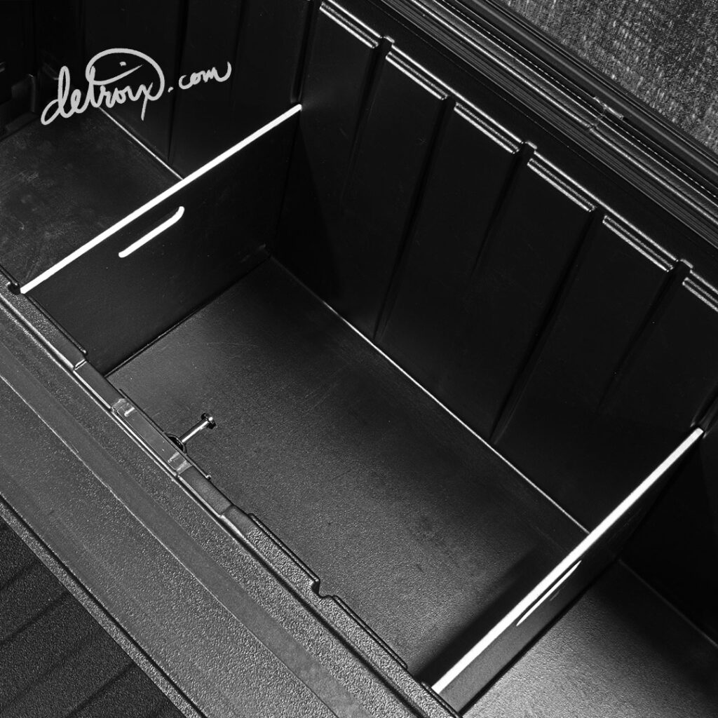
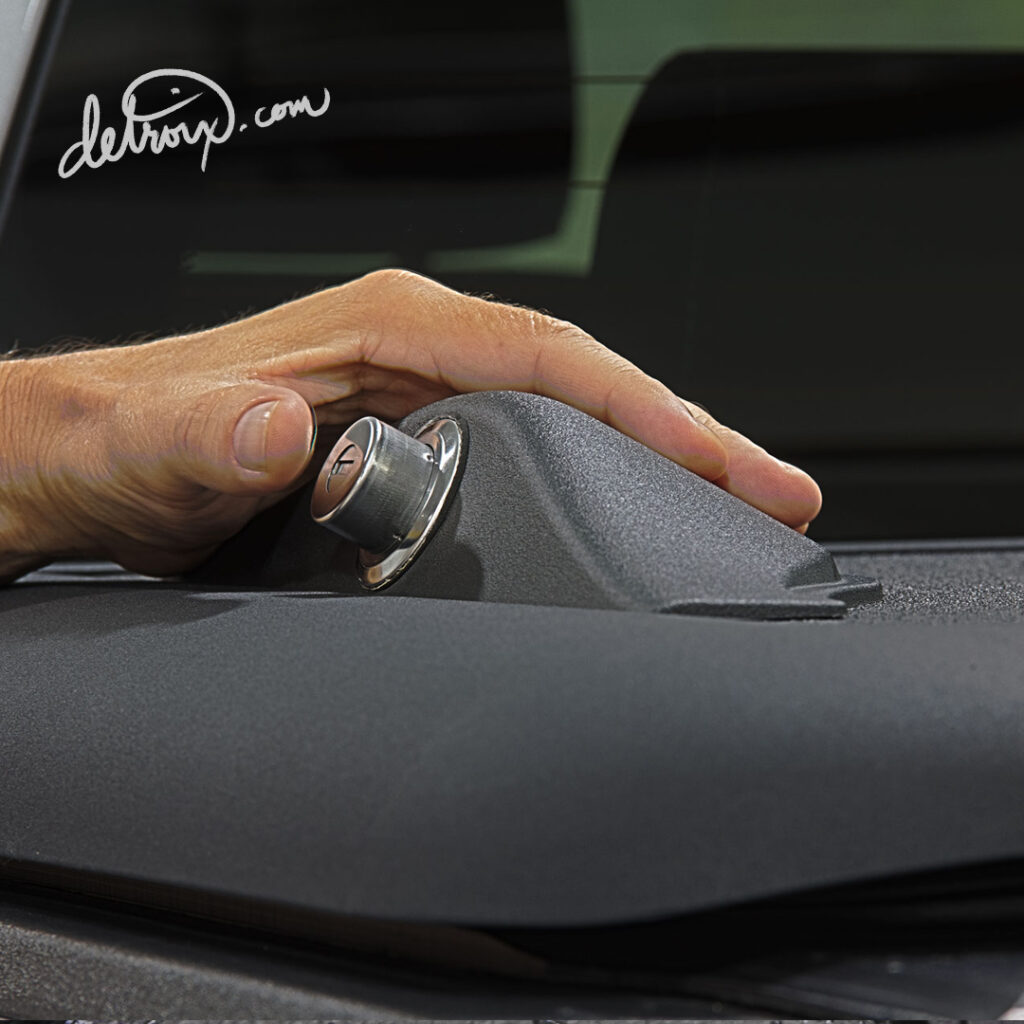
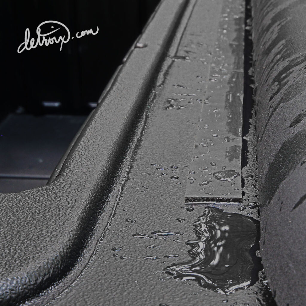
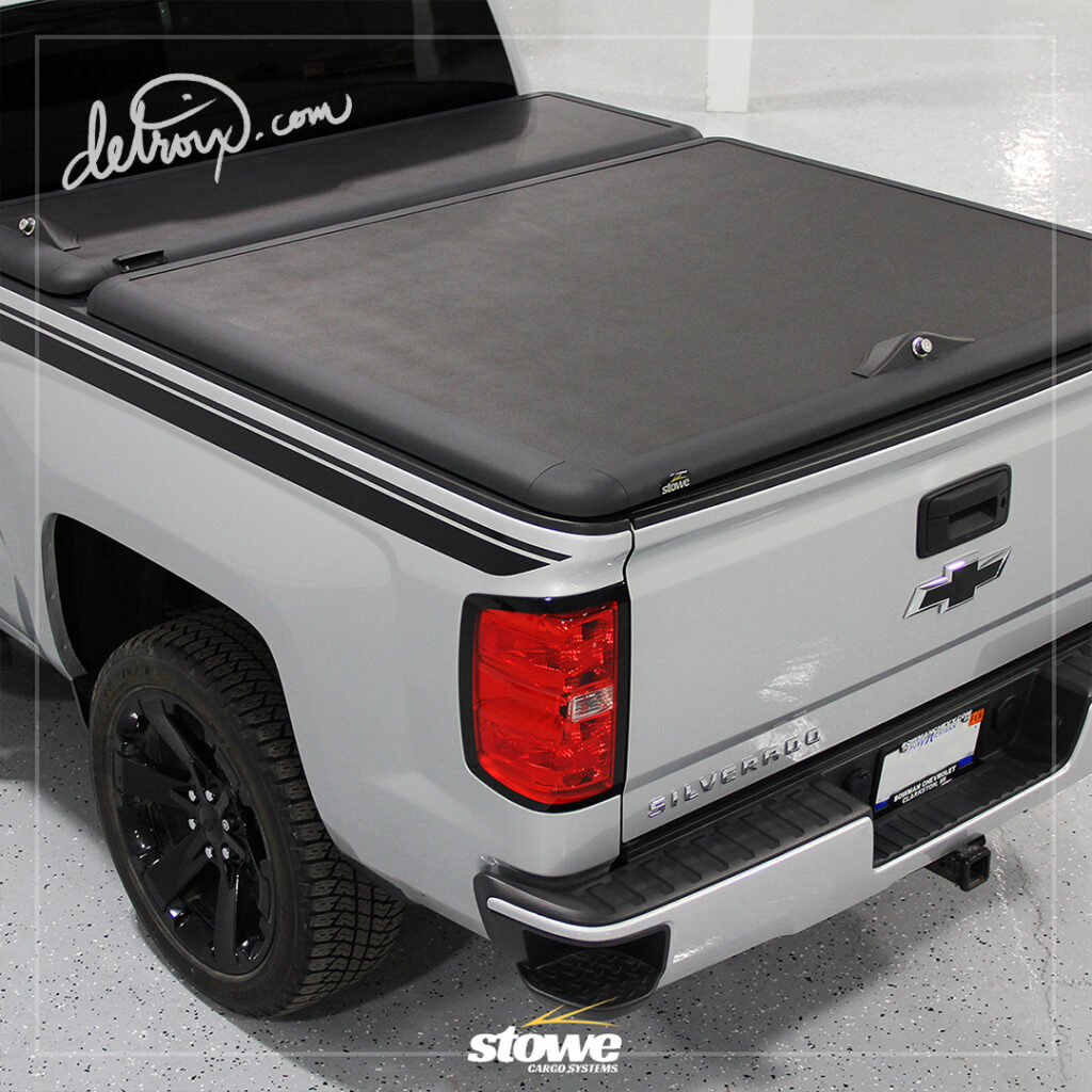
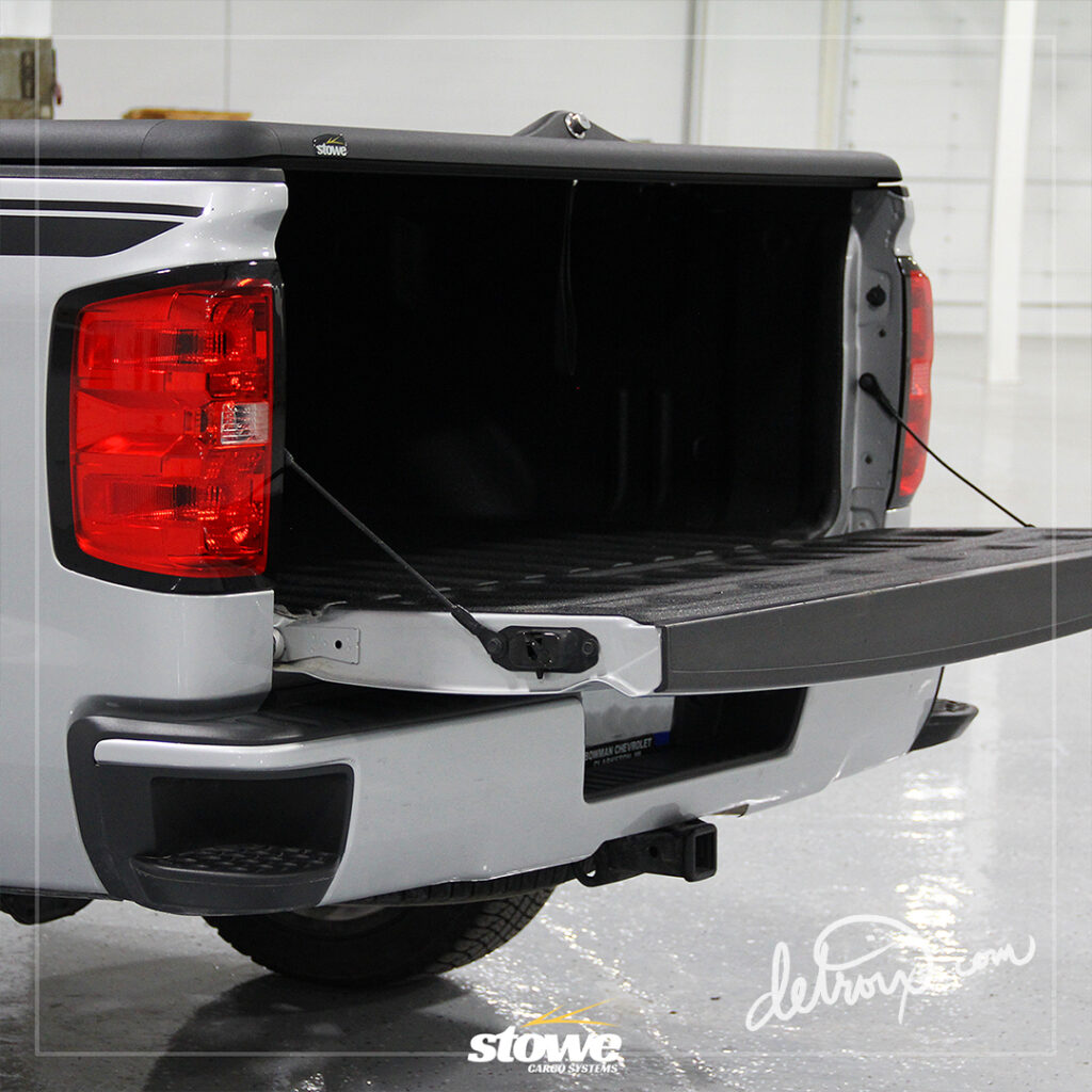
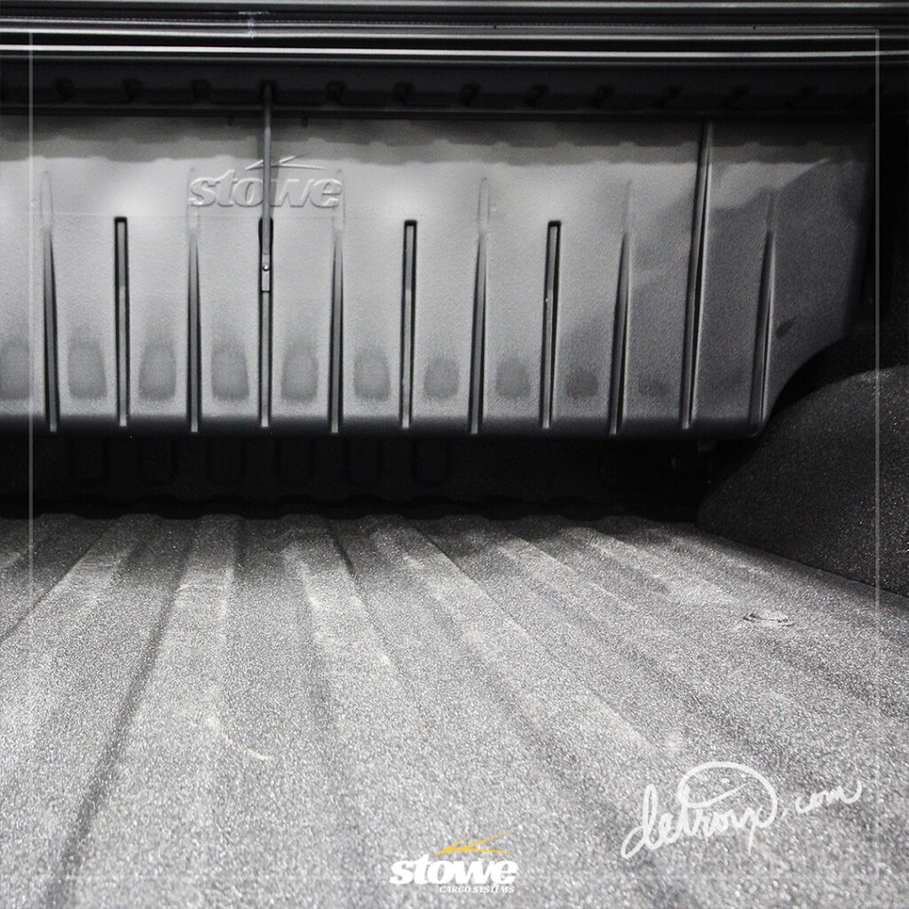
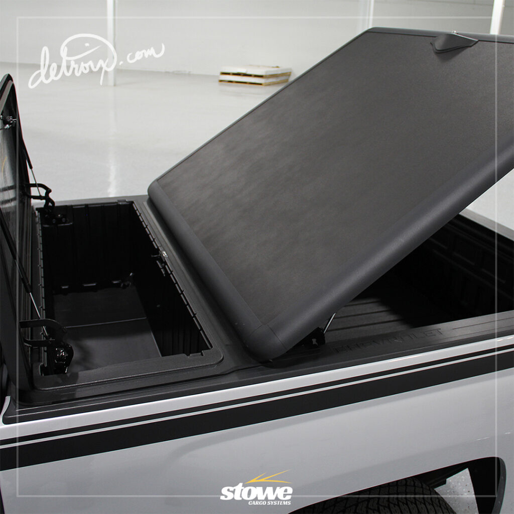
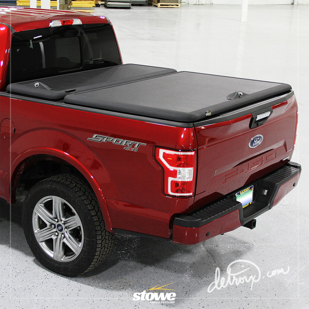
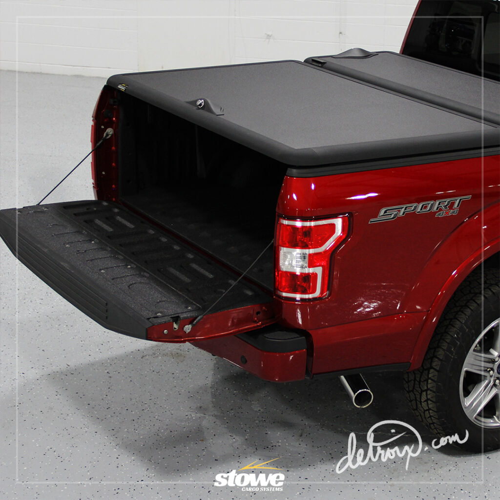
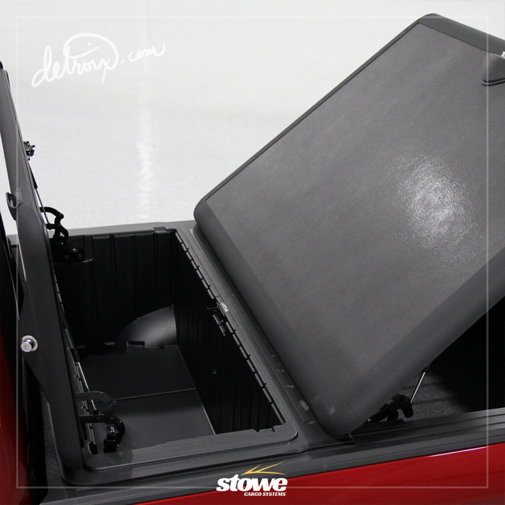
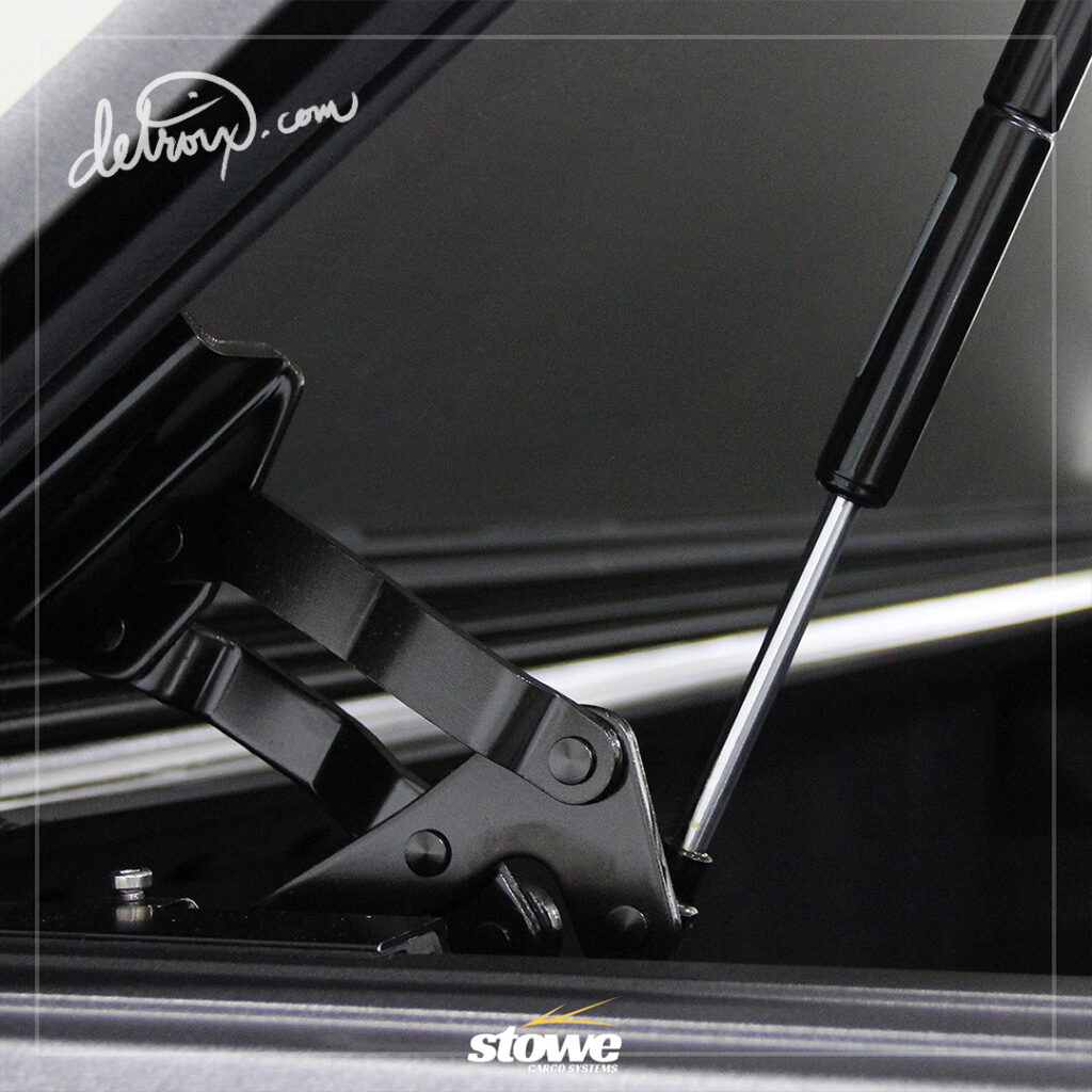
Below you will find a variety of photography styles captured. They are only slightly enhanced and used in various media formats. Some images were used for print media and others on the official website or social media.
I shoot with a Canon DSLR with a variety of lenses and have roughly 20 years of experience in photography. The first time I picked up a professional camera, I was 16 years old and shooting on film.
Throughout the years, I’ve gotten comfortable shooting automotive / technical related material, but can shoot everything from Portraits to Weddings and everything in between.
The Social Presence
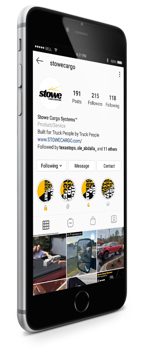
While I was on the road initially, rather than solely focusing on sales in the traditional format, I found myself doing a significantly better job at promoting their product via social media platforms than the actual outsourced company responsible for Social Media Management. In their defense, the outsourced company didn’t have the leverage I did, because I had boots on the ground – sharing the experiences and product benefits as the tour unfolded, but it was also a great opportunity to travel, utilize my talents to benefit a small business and put some wind in it’s sails.
As time went by, I was offered a more permanent position. I was responsible for brainstorming, post schedule planning, photography, designing of graphics, and execution on the various social media platforms. Below you will find a few examples of social media posts I had created. If you want to view more, check them out on Instagram @ https://www.instagram.com/stowecargo/
( Any posts after 3/23/20 are not of my creation. )
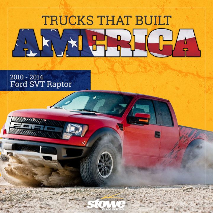
Sample 1: Trucks That Built America – To expand our reach, I would put posts together that would hail iconic trucks of our past. These would generate great conversations, drive engagement and brand awareness.
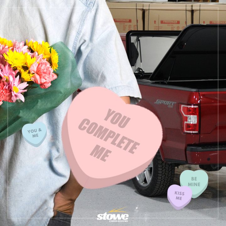
Sample 2: Throughout the year I would put together clever holiday posts.
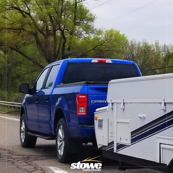
Sample 3: This sample is not entirely real, but 100% applicable. I was driving to the office on a Friday morning and saw this Ford F150 pulling a weekend trailer
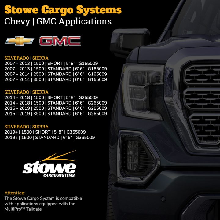
Sample 4: The idea was to bring the fitment chart to the public, rather than solely relying on them to make it to the website to find the information.
The Analytics & UX
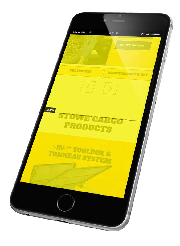
While collaborating with the massive website overhaul, one of the primary objectives were to enhance conversion rates, lower bounce rates, and track user activity to study the data and continuously improve the website.
Once the website was launch, even though we fine tuned things as best as we could, we needed to be able to understand how users were interacting with the website. There is a very helpful tool called, Hotjar available for a variety of platforms ranging from Wix websites to WordPress CMS websites.
This tool allows you to literally watch user interactions as they navigate through your website. Whatever your imagining in your head is exactly what it does. With a FREE account you can track these visitors, view heatmaps of designated webpages for scrolling and clicks.
When we activated the tool, we let it run for a duration of time, long enough to collect enough data to analyze. We found that users were scrolling the homepage, but the user activity dramatically dropped between the landing page and the product benefits page.
As a premium priced product, it was imperative that potential clients understood the immense value the product offered. So what was going on? I was convinced it had something to do with the choice of words we used on the homepage for the product selection buttons. Originally they said BUY or BUY NOW. I suggested that we change the buttons to say “LEARN MORE” because there’s no pressure involved, and in fact you do learn more on the page to follow.
Thanks to Hotjar and my ability to digest the data collected; our ability to drive users further down the sales funnel increased nearly 170% and the traffic increased between the product value page to the purchase page. Great tool. Highly recommended.
The Sales & CRM Management
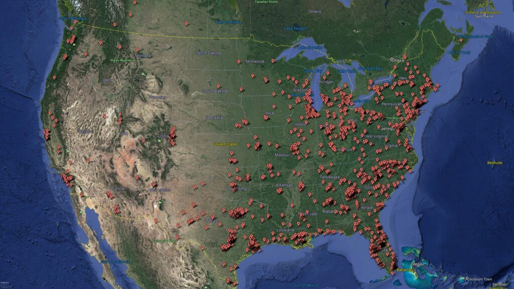
Now that the website was complete, print media was almost wrapped up, and our in-store display was just about complete, it was crunch time to finish planning the Stowe tour. We wanted to get our in-store display into truck accessory shops, introduce ourselves to national and regional distributors, add dealers to our dealer locator, and perform as many curbside demonstrations as possible. But where do we go? We couldn’t just go everywhere.

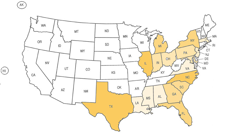
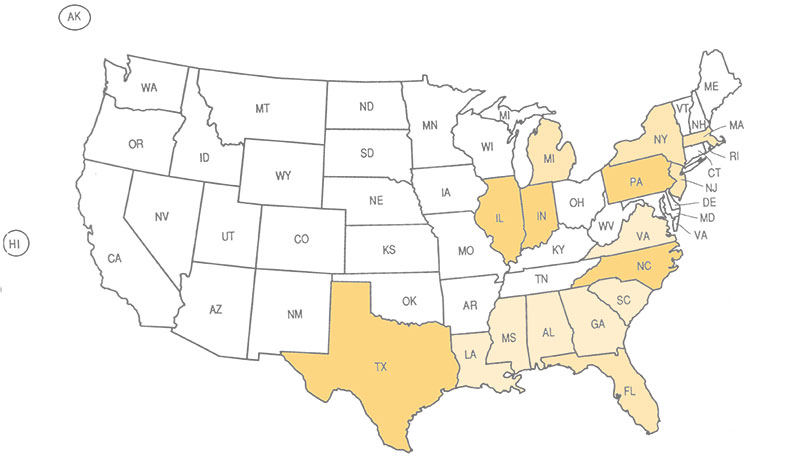
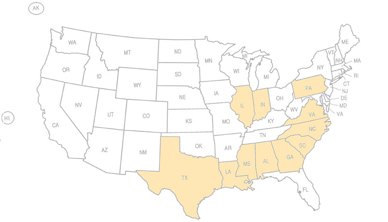
Since I began with the company, they had me monitoring the Facebook Ads, Google Analytics, and processing incoming orders. Extrapolating all of this information, I was able to determine where all of our traffic had been coming from for the previous 2-3 years, where our Facebook user’s activity was originating, and each purchase and abandoned cart was tagged with the users IP address which could be traced back to a general location.
Once this data was understood, I built a graphic to better understand which states we should focus on the most based on activity. You can swipe through the images below to understand how the data was used and which states surfaced to the top.
Before I hit the road, I ditched the homemade CRM with Excel and started using HubSpot. For anyone looking for a CRM that is easy to use, powerful in the sense of reminders, tracking, and receiving notifications based on recipients interactions with emails you send – This is the tool you need. I plan to go into more depth about HubSpot in an article in the future, but in the meantime you need to check them out.
With this incredible CRM I was able to track where sold units were going, which distributors were selling them, who was receiving them, automating product review requests to grow our online rapport and simultaneously improve our Google ranking.
